.jpg)
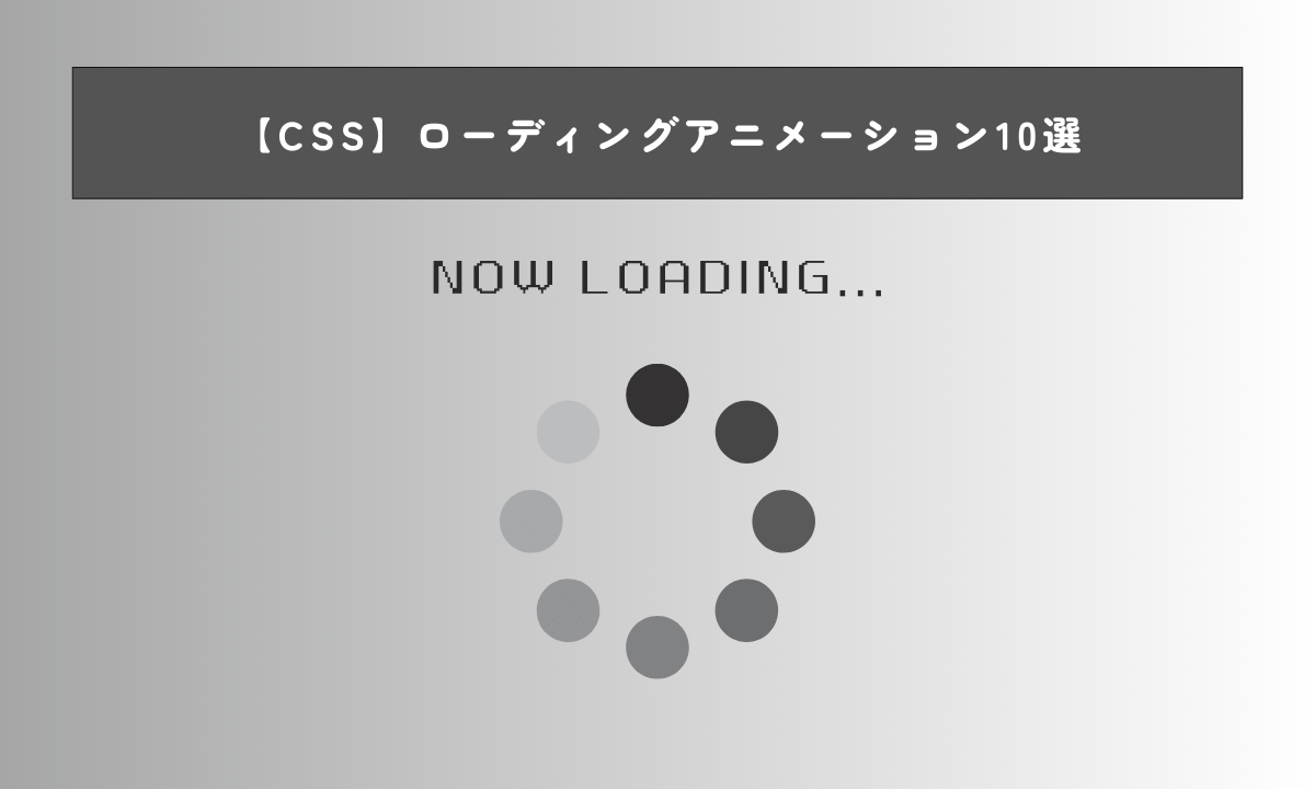
この記事では、「CSSでできるローディングアニメーション」について解説します。
ローディングアニメーションでありそうなパターンを10個紹介していきます。
- CSSでローディングアニメーションを作る方法がわかる
- 10個のローディングアニメーションの実装方法が具体的にわかる
- コーディング速度を上げて時給単価をもっと上げたい!
- コードを管理する時間がないからまとめられたスニペット集が欲しい!
そういった方向けにNotionスニペットコーディング実践集を作成しました。
こちらのスニペットコーディング集でもFLOCSSを活用して効率的なコーディングをしています。
ご興味ある方はあわせて読んで見てください。

目次
CSSでローディングアニメーションを作る方法
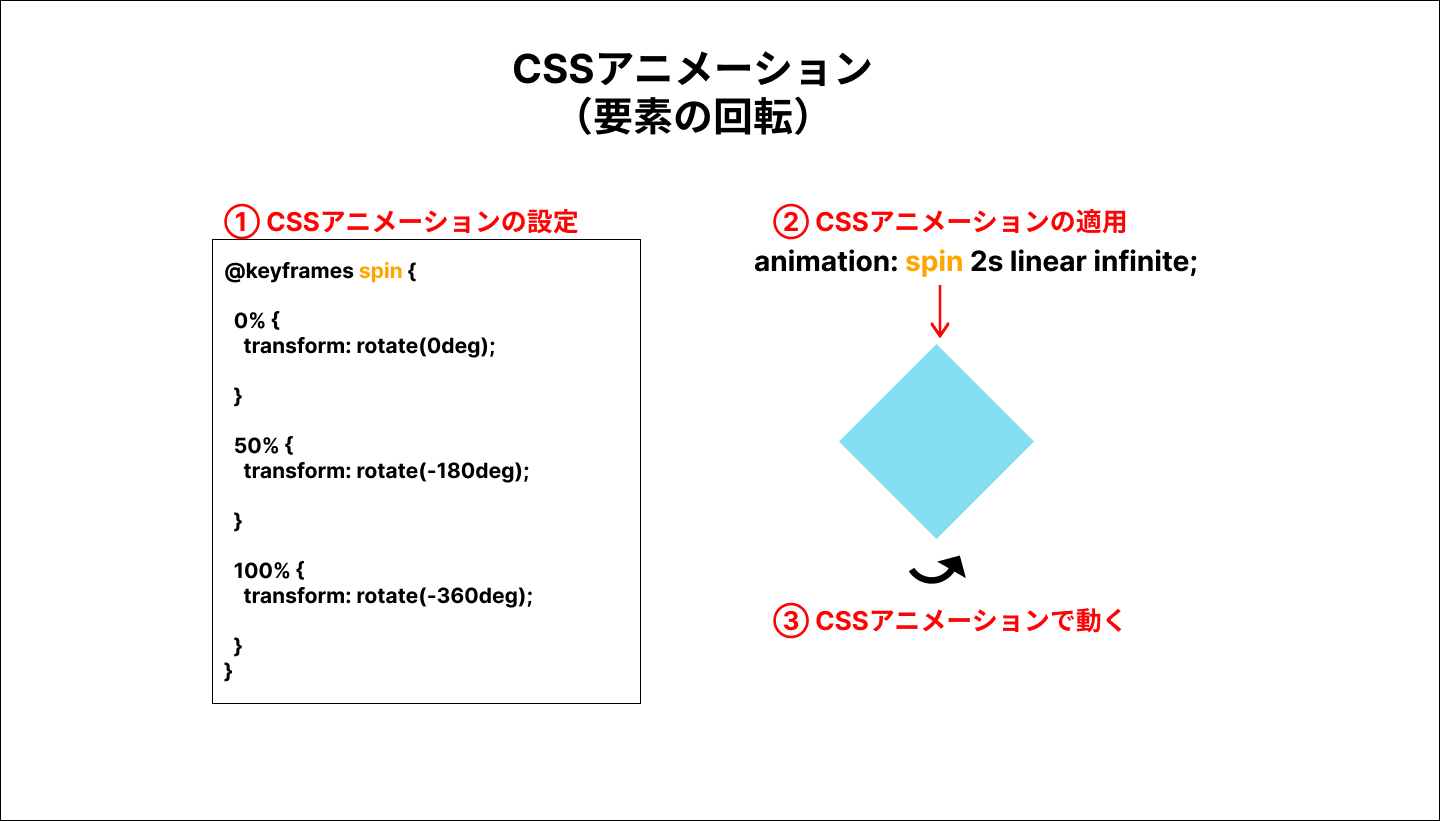
CSSでローディングアニメーションで実装する場合、HTMLとCSSで見た目を作成します。
アニメーションの動きの部分は、CSSの@keyframesを使用します。
例えば、以下のように記述してspinという名前のアニメーションを作ることができます。
この場合、初期状態で回転(rotateプロパティ)が0、50%で-180度回転、100%で-360度回転、というアニメーションになります。
@keyframes spin {
  0% {
    transform: rotate(0deg);
  }

  50% {
    transform: rotate(-180deg);
  }

  100% {
    transform: rotate(-360deg);
  }
}
設定したアニメーションを適用する場合、アニメーションさせたい要素に対して、animationプロパティを設定することで、実際に要素が動くようになります。
例えば、要素に以下のように記述すると、keyframesで設定した動きが実装できるようになります。
animation: spin 2s linear infinite;以下のような作成イメージになります。
ローディングアニメーション1 要素の回転
コードは以下になります。
<div class="l-container">
  <div class="c-box"></div>
</div>
.l-container {
  display: flex;
  align-items: center;
  justify-content: center;
  height: 100vh;
}


/* ローディング1 */
.c-box {
  width: 50px;
  height: 50px;
  position: relative;
  background-color: skyblue;
  animation: spin 2s linear infinite;
}


.c-box::before {
  content: '';
  position: absolute;
  top: 0;
  left: 0;
  width: 50px;
  height: 50px;
  background-color: lightblue;
  animation: spin2 2s linear infinite;

}


@keyframes spin {
  0% {
    transform: rotate(0deg);
  }

  50% {
    transform: rotate(-180deg);
  }


  100% {
    transform: rotate(-360deg);
  }
}


@keyframes spin2 {
  0% {
    transform: rotate(180deg);
  }


  50% {
    transform: rotate(0deg);
  }

  100% {
    transform: rotate(360deg);
  }
}
See the Pen ローディングアニメーション1 要素の回転 by 山中滉大 (@tips-web) on CodePen.
二つの四角形の要素を、それぞれ異なるCSSアニメーションで実装しています。この場合は、rotateプロパティの角度をアニメーションで変化させています。
これらのコードの基本的なCSS設計はこちらの記事を参考にしてください。
FLOCSSで保守性を上げれる様にしています。
ローディングアニメーション2 要素の回転2
コードは以下になります。
<div class="l-container">
  <div class="c-square"></div>
</div>
.l-container {
  display: flex;
  align-items: center;
  justify-content: center;
  height: 100vh;
}

.c-square {
  width: 50px;
  height: 50px;
  background-color: skyblue;
  animation: spin 2s linear infinite;
}


@keyframes spin {
  0% {
    transform: rotateY(0deg);
  }

  25% {
    transform: rotateY(180deg);
  }


  50% {
    transform: rotateX(180deg);
  }

  75% {
    transform: rotateY(0deg);
  }


  100% {
    transform: rotateZ(360deg);
  }
}
See the Pen ローディングアニメーション2 要素の回転2 by 山中滉大 (@tips-web) on CodePen.
こちらの場合、rotateX、rotateY、rotateZの3つのプロパティを組み合わせています。
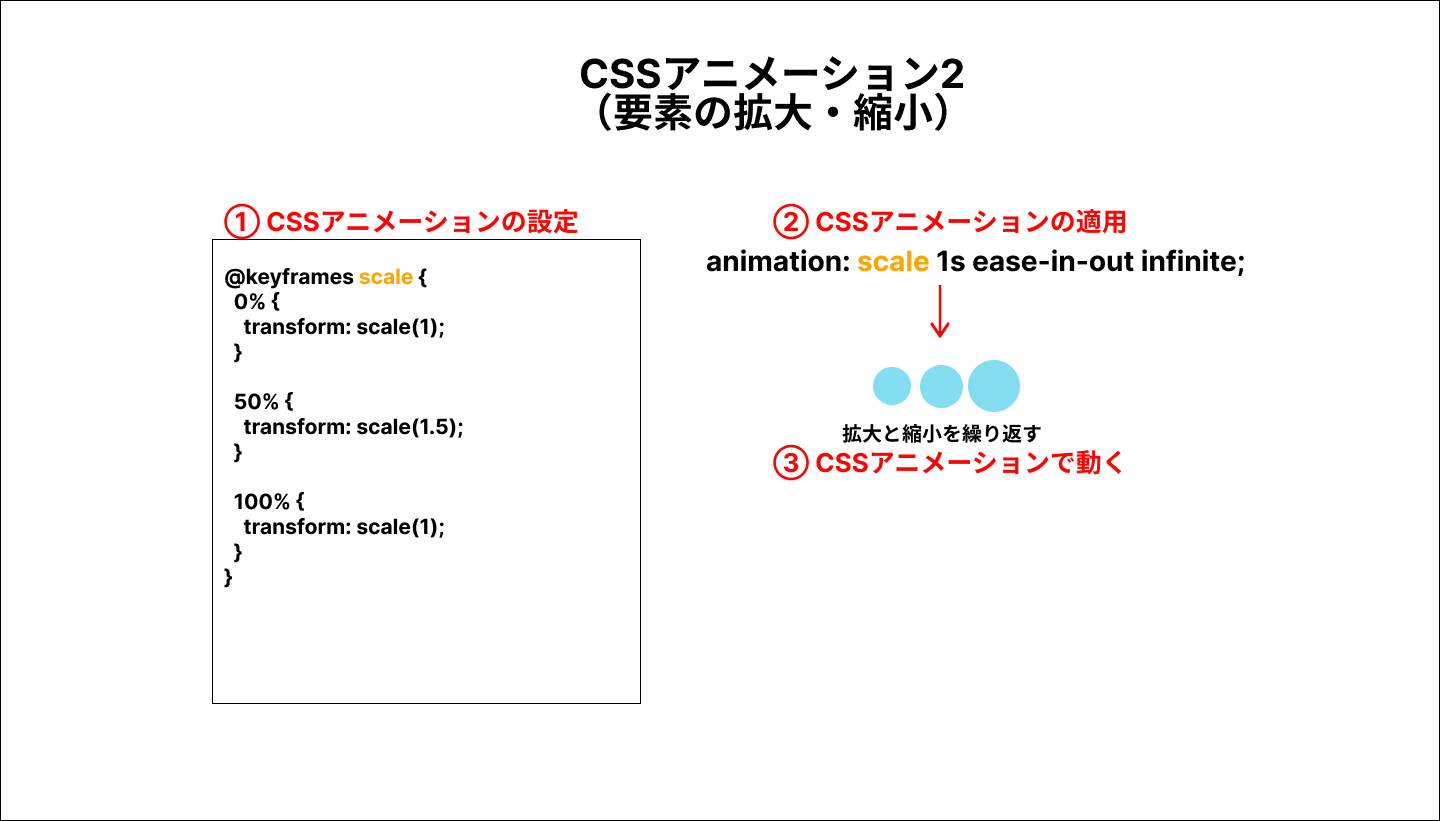
ローディングアニメーション3 要素の拡大・縮小
コードは以下になります。
<div class="l-container">
  <div class="c-circle">
      <div class="c-circle__box"></div>
      <div class="c-circle__box"></div>
      <div class="c-circle__box"></div>
  </div>
</div>
.l-container {
  display: flex;
  align-items: center;
  justify-content: center;
  height: 100vh;
}


.c-circle {
  display: flex;
  gap: 10px;
}


.c-circle__box {
  width: 20px;
  height: 20px;
  background-color: skyblue;
  border-radius: 50%;
}


.c-circle__box:nth-child(1) {
  animation: scale 1s ease-in-out infinite;
}


.c-circle__box:nth-child(2) {
  animation: scale 1s ease-in-out infinite;
  animation-delay: .4s;
}


.c-circle__box:nth-child(3) {
  animation: scale 1s ease-in-out infinite;
  animation-delay: .8s;
}


@keyframes scale {
  0% {
    transform: scale(1);
  }

  50% {
    transform: scale(1.5);
  }

  100% {
    transform: scale(1);
  }
}
See the Pen ローディングアニメーション3 要素の拡大・縮小 by 山中滉大 (@tips-web) on CodePen.
この場合、flexboxで横並びにした3つの丸を、scaleプロパティで大きくなったり小さくなったりするアニメーションを設定しています。
以下のようなイメージになります。
ローディングアニメーション4 要素の回転3
コードは以下になります。
<div class="l-container">
  <div class="c-circle">
      <div class="c-circle__box"></div>
      <div class="c-circle__box"></div>
      <div class="c-circle__box"></div>
  </div>
</div>
/* ローディング4 */
.l-container {
display: flex;
align-items: center;
justify-content: center;
height: 100vh;
}
.c-circle {
display: flex;
gap: 10px;
animation: rotation 1s ease-in-out infinite;
}
.c-circle__box {
width: 20px;
height: 20px;
background-color: skyblue;
border-radius: 50%;
}
@keyframes rotation {
0% {
transform: rotate(0);
}
50% {
transform: rotateZ(90deg);
}
100% {
transform: rotateZ(180deg);
}
}
See the Pen ローディングアニメーション4 要素の回転3 by 山中滉大 (@tips-web) on CodePen.
この場合、rotateZプロパティを使って中央の丸を中心に要素を回転させるアニメーションを設定しています。
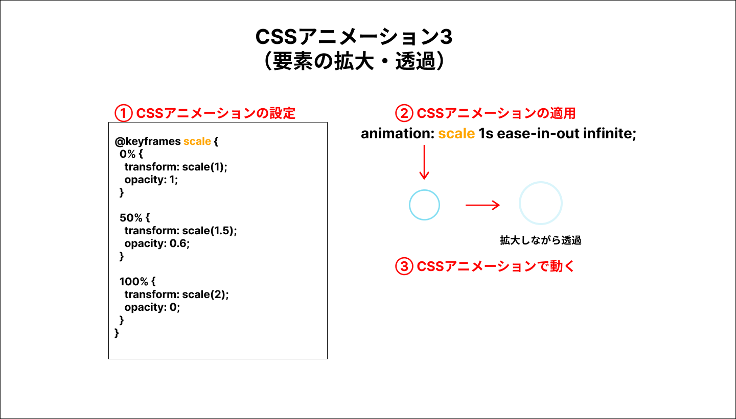
ローディングアニメーション5 要素の拡大と透過
コードは以下になります。
<div class="l-container">
  <div class="c-circle"></div>
</div>
.l-container {
  display: flex;
  align-items: center;
  justify-content: center;
  height: 100vh;
}

.c-circle {
  animation: scale 1s ease-in-out infinite;
  width: 20px;
  height: 20px;
  border: 2px solid skyblue;
  border-radius: 50%;
}


@keyframes scale {
  0% {
    transform: scale(1);
    opacity: 1;
  }

  50% {
    transform: scale(1.5);
    opacity: 0.6;
  }

  100% {
    transform: scale(2);
    opacity: 0;
  }
}
See the Pen ローディングアニメーション5 要素の拡大と透過 by 山中滉大 (@tips-web) on CodePen.
この場合、要素が大きくなった後opacityで透明になるアニメーションを実装しています。
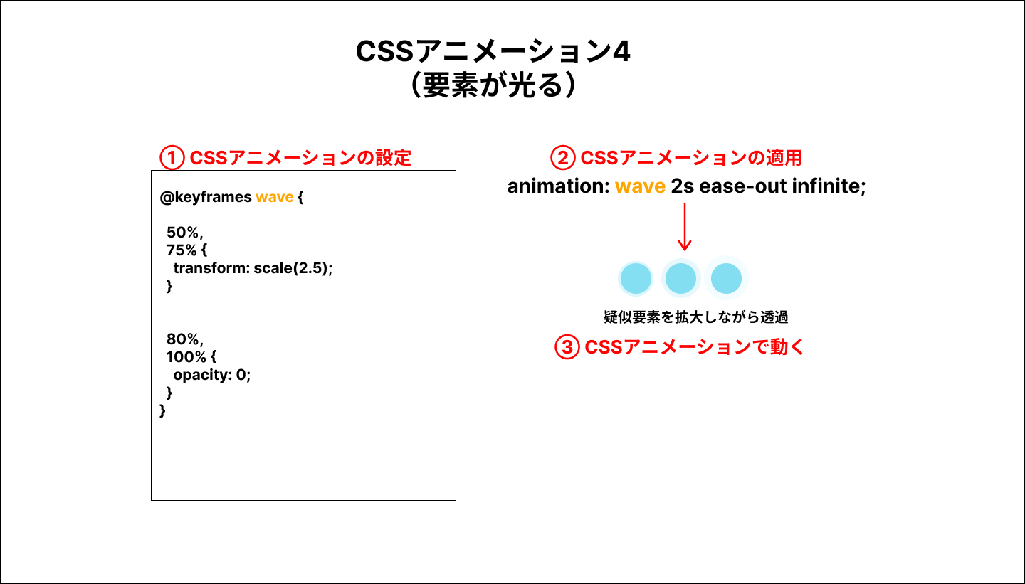
ローディングアニメーション6 要素が光る
コードは以下になります。
<div class="l-container">
    <div class="c-circle">
      <div class="c-circle__box"></div>
      <div class="c-circle__box"></div>
      <div class="c-circle__box"></div>
    </div>
</div>
.l-container {
display: flex;
align-items: center;
justify-content: center;
height: 100vh;
}
.c-circle {
display: flex;
gap: 10px;
}
.c-circle__box {
width: 20px;
height: 20px;
background-color: skyblue;
border-radius: 50%;
position: relative;
}
.c-circle__box::before {
position: absolute;
content: "";
width: 100%;
height: 100%;
background: inherit;
border-radius: 50%;
animation: wave 2s ease-out infinite;
}
.c-circle__box:nth-child(1)::before {
animation-delay: .2s;
}
.c-circle__box:nth-child(2)::before {
animation-delay: .4s;
}
.c-circle__box:nth-child(3)::before {
animation-delay: .6s;
}
@keyframes wave {
50%,
75% {
transform: scale(2.5);
}
80%,
100% {
opacity: 0;
}
}
See the Pen ローディングアニメーション6 要素が光る by 山中滉大 (@tips-web) on CodePen.
この場合、要素に対して疑似要素を作成し、その疑似要素に、scaleプロパティで拡大しながらopacityプロパティで透過させていくアニメーションを実装しています。
ローディングアニメーション7 要素の回転4
コードは以下になります。
<div class="l-container">
    <div class="c-circle">
      <div class="c-circle__box"></div>
    </div>
</div>
.l-container {
display: flex;
align-items: center;
justify-content: center;
height: 100vh;
}
.c-circle {
display: flex;
gap: 10px;
animation: spin 2s linear infinite;
width: 100px;
height: 100px;
border-radius: 50%;
background-color: skyblue;
}
.c-circle__box {
border-radius: 50%;
background-color: #fff;
box-shadow: 0 0 20px lightblue;
width: 40px;
height: 40px;
}
@keyframes spin {
0% {
transform: rotate(0deg);
}
100% {
transform: rotate(360deg);
}
}
See the Pen ローディングアニメーション7 要素の回転4 by 山中滉大 (@tips-web) on CodePen.
この場合、2つの丸の要素を重ねて、rotateプロパティで全体を回転させるアニメーションを設定しています。なお、小さい丸にはbox-shadowプロパティを指定しています。
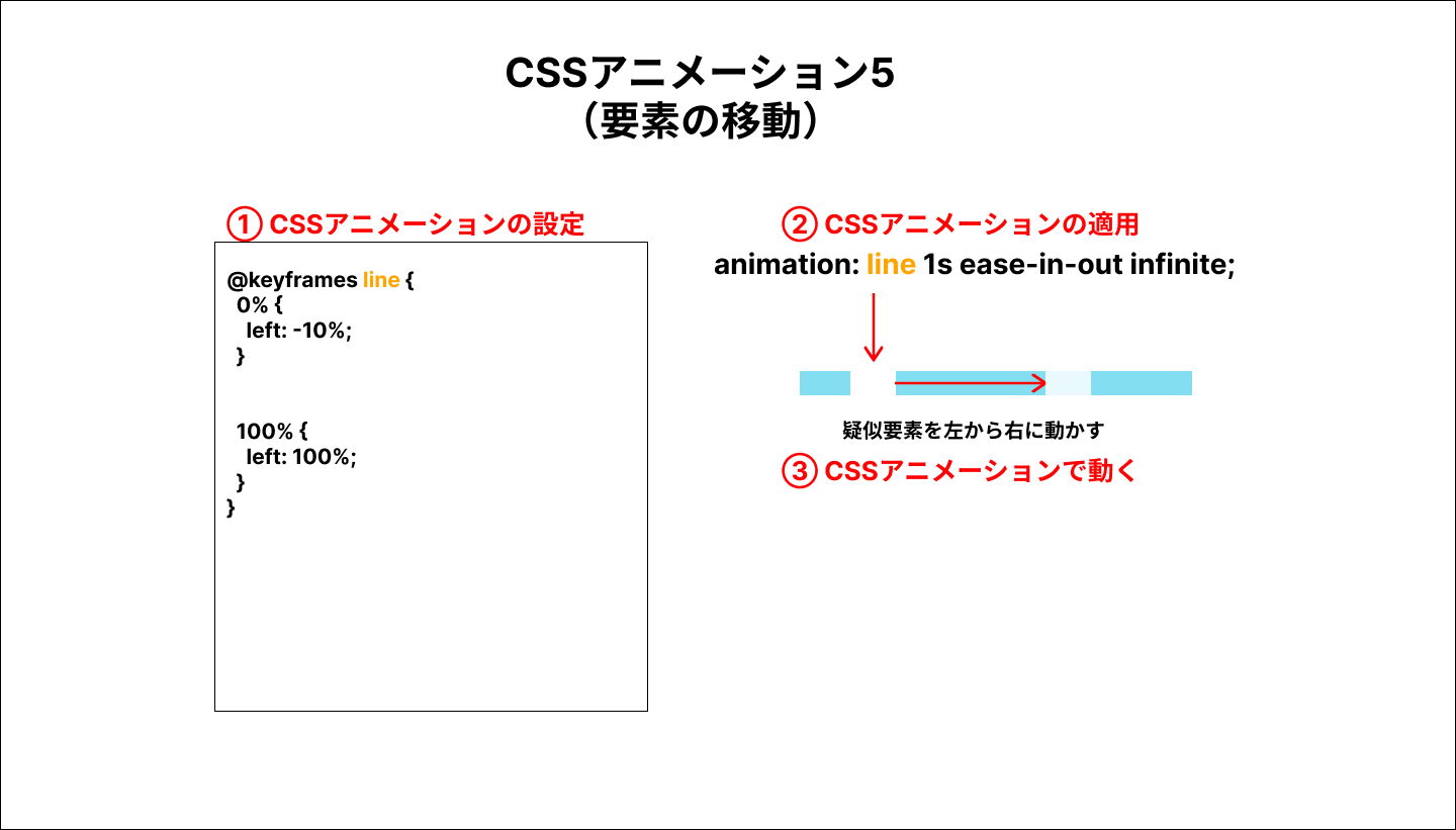
ローディングアニメーション8 線の移動
コードは以下になります。
<div class="l-container">
 <div class="c-line"></div>
</div>
.l-container {
  display: flex;
  align-items: center;
  justify-content: center;
  height: 100vh;
}

.c-line {
  overflow: hidden;
  width: 200px;
  height: 10px;
  background-color: skyblue;
  position: relative;
}


.c-line::before {
  content: "";
  position: absolute;
  animation: line 1s ease-in-out infinite;
  top: 0;
  left: 0;
  width: 40px;
  height: 100%;
  display: block;
  background-color: #fff;
}


@keyframes line {
  0% {
    left: -10%;
  }


  100% {
    left: 100%;
  }
}
See the Pen ローディングアニメーション8 線の移動 by 山中滉大 (@tips-web) on CodePen.
この場合、疑似要素で作成した要素を、leftプロパティで左から右に移動するようなアニメーションを設定しています。
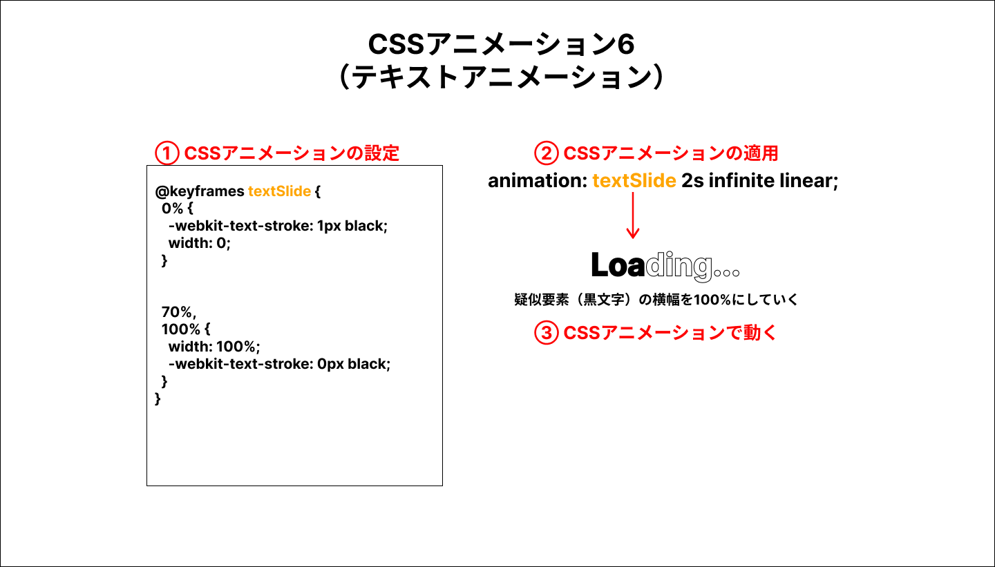
ローディングアニメーション9 テキストアニメーション
コードは以下になります。
<div class="l-container">
  <div class="c-loading">
      <p class="c-loading__text">Loading...</p>
    </div>
</div>
.l-container {
  display: flex;
  align-items: center;
  justify-content: center;
  height: 100vh;
}


.c-loading__text {
  position: relative;
  font-size: 2rem;
  font-weight: bold;
  color: transparent;


  -webkit-text-stroke: 1px black;
}


.c-loading__text::before {
  position: absolute;
  left: 0;
  top: 0;
  overflow: hidden;
  width: 0;
  color: black;
  animation: textSlide 2s infinite linear;
  content: "Loading...";
}


@keyframes textSlide {
  0% {
    -webkit-text-stroke: 1px black;
    width: 0;
  }


  70%,
  100% {
    width: 100%;
    -webkit-text-stroke: 0px black;
  }
}
See the Pen ローディングアニメーション9 テキストアニメーション by 山中滉大 (@tips-web) on CodePen.
この場合、-webkit-text-strokeプロパティでテキストを縁取りさせます。疑似要素で文字を作成し、その横幅を初期値が0にし、横幅が100%になると縁取りになっていた文字色が塗りつぶされるようなアニメーションを実装しています。
ローディングアニメーション10 グラデーションで回転
コードは以下になります。
<div class="l-container">
  <div class="c-circle"></div>
</div>
.l-container {
  display: flex;
  align-items: center;
  justify-content: center;
  height: 100vh;
}


.c-circle {
  position: relative;
  width: 100px;
  height: 100px;
  border-radius: 50%;
  background-image: linear-gradient(135deg, #9eede9 10%, #71bae7 100%);
  animation: circle 1.5s linear infinite;
}


.c-circle::before {
  position: absolute;
  top: 3px;
  left: 3px;
  bottom: 3px;
  right: 3px;
  border-radius: 50%;
  background-color: #fff;
  content: ''
}


@keyframes circle {
  0% {
    transform: rotate(0deg)
  }


  100% {
    transform: rotate(360deg)
  }
}
See the Pen ローディングアニメーション10 グラデーションで回転 by 山中滉大 (@tips-web) on CodePen.
この場合、グラデーションで要素を作成し、アニメーションで要素を回転させて線が光っているような実装にしています。
まとめ
CSSでできるローディングアニメーションについて10個紹介しました。よくあるパターンなので、テンプレートとしてあらかじめ用意しておくといいでしょう。